Last week, I was buying tickets to an AIGA NY event and I was slightly taken aback at their checkout process. Now, being that I design checkouts for a living, I'll admit I'm probably overly sensitive to speed bumps in the checkout process, but I like to think that AIGA NY (the NYC chapter of the renowned national design organization AIGA) is equally sensitive to user interfaces and design layouts.
A checkout has a single purpose - to gain a shopper's information/payment. Since people aren't thrilled to be giving away their hard-earned money, checkouts need to make this process as efficient and mindless as possible. I thought I'd give this Registration page the 1, 2, 3 touch, because what's a little usability problem between friends? Below is the first page of their checkout.

Two things hindered me from making my purchase:
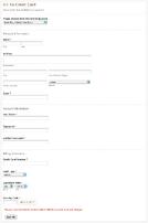
1. User Confusion. Please stop with the cancel buttons during the checkout. Here, the cancel button returns the user to the event information page. If a user doesn't want to submit their information, they'll hit the back button or exit the browser. A cancel button could easily be clicked by an unobservant user, particularly if it's positioned directly under the form, the way this cancel button is. The location of the cancel button and add to cart button add to the likelihood of the mistake. We read from left to right; items on the left are received as more prominent. The left-hand alignment underneath the form is a double dose of "CLICK ME" syndrome, not good for a cancel button. A cancel button is more likely to deter a shopper than help them.
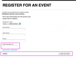
2. Mislabeling. Note the field: AIGA Member ID. I see this, and I stop. I pause. I think about it some more. Do they mean my AIGA, online, website log-in ID? Or do they mean my AIGA member number that's printed on my membership card? What do you think? I figure, I'm online, I'll try my website ID.
I knew I was wrong when my log-in ID wouldn't fit into the text field box. Thank you to that small piece of information. I grabbed my membership card and voila, my member number fit. Why isn't the label member number instead of ID?
Now, I really wanted to go to this event. I was going to get through this checkout no matter what. But what about an online shopper buying printing paper, or a halloween costume, or a gift basket? If you're content with your checkout, take just a few minutes to go through and check all of the labels. Is anything ambiguous or mislabeled? Is there anything at all that could be slowing down a shopper?

3. No Progress. The AIGA NY registration page isn't your typical checkout. When you register someone for an event, that's actually the "product" that goes into the cart. Notice the statement "betsy ross has been added to your cart." (Note: I use whatever name I think of first when test sites. I do not have a hidden identity.) This isn't ideal, but my concern is mainly that a user is returned to a page they already completed.
Visually, very little has changed, and my eye is still drawn to the form and the Add to Cart button. What am I supposed to do on this page? Oh, I'm supposed to click that light blue link that reads "Proceed to Checkout." This link is just an additional click (and thus, deterrent), in the checkout process. A user should be directly routed to the cart if an ajax mini-cart or light-box isn't possible on the product page.
I think this is particularly true for this site because if a shopper wanted to buy/reserve someone else's spot, there is already a link on the page to do so. By returning to this Registration product page, it only lengthens the time it takes to complete checkout, potentially increasing abandonment rates.
For a quick and simple checkout, this checkout shows that it's all about the details. And each one of those details is crucially important.
Mentioned in this post:
Registration Page | AIGA NY