

Full-Service eCommerce SEO Agency
Is Your eCommerce SEO Company Creating Headaches?
If you are experiencing poor search engine ranking and decreased organic search traffic, your SEO service may be to blame. From quality content production to managing algorithm updates, learn how Groove can help your brand optimize for the future.
- Is your website not generating the expected organic search traffic and rankings?
- Are you struggling to create high-quality blog and website content?
- Are you overwhelmed with algorithm updates?
- Are you dealing with setbacks from a past eCommerce SEO consultant
We've heard it all before. Good thing we're here to help.


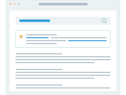
Do You Know Your Store's SEO Health Score?
What Makes Our eCommerce SEO Strategy Different
eCommerce SEO Strategist
Repeatable SEO Process
Quarterly Business Reviews
Weekly SEO Monitoring & Updates
Transparent Timelines & Cost
Real-Time Performance Reporting
Make SEO Easy with Clearly Priced Plans
Groove stresses expediency and affordability with one of our eCommerce SEO Packages. Unlock your true eCommerce potential with the right plan for you.
Looking for something fully custom? Contact our team for a curated quote.


What's Holding You Back?
Learn about eCommerce SEO
All types of eCommerce businesses can benefit from a well-planned SEO campaign from a leading SEO agency. Please check out our SEO-focused collection of blogs, our e-book, and our case study results.

Increasing a Fashion Brand’s Revenue by 50% with SEO
When a client approached our team with a goal of increasing organic search revenue by 40% YoY, we worked to surpass that goal and grew revenue by over 50%.
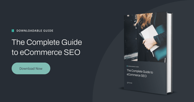
The Complete Guide to eCommerce SEO
We're demystifying eCommerce SEO in this comprehensive guide and sharing actionable tips and strategies to improve eCommerce organic search rankings.

The Ultimate Shopify SEO Checklist
Having a roadmap like a Shopify SEO checklist can jumpstart your eCommerce traffic.
We’ve helped hundreds of merchants grow their stores, and we can help you too.


Schedule A Call With Our
eCommerce SEO Agency