
You stumble into an elevator on a Monday morning with a much-needed cup of coffee in one hand and an umbrella and briefcase in the other hand. You mutter a grumbled greeting to your riding partner.
Looking up, you realize your partner is none other than your idol. Do you tell them how much you love their work? Do you introduce yourself? Ask for an autograph?
Ding. Too late. Your eight-second ride is up, your idol exits the elevator and you are left in the dust. This unsuccessful attempt at making an impression epitomizes our eCommerce world today.
We live in a world where an online brand's first (and probably only) encounter with a consumer has been reduced to a few seconds. HubSpot even recommends websites to tell visitors what they have to offer within 3 seconds.
Attracting and maintaining consumers' attention that quickly means using an above the fold website design strategy. That's why we're sharing these highly appreciated eCommerce site designs.
eCommerce Site Designs That Drive Conversion
As consumers, we are inundated with thousands of daily branded pieces of content each day. It is nearly impossible to see, digest and act upon every single one of these, and only a small portion of them leaves an impression on us.
Let's take a look at one category of branded content in particular: the website. A brand's website serves as both the introduction to the brand and a way to purchase its products. In fact, the majority of first impressions come from a brand's website design.
See how these eCommerce site designs utilize various strategies to drive conversion.
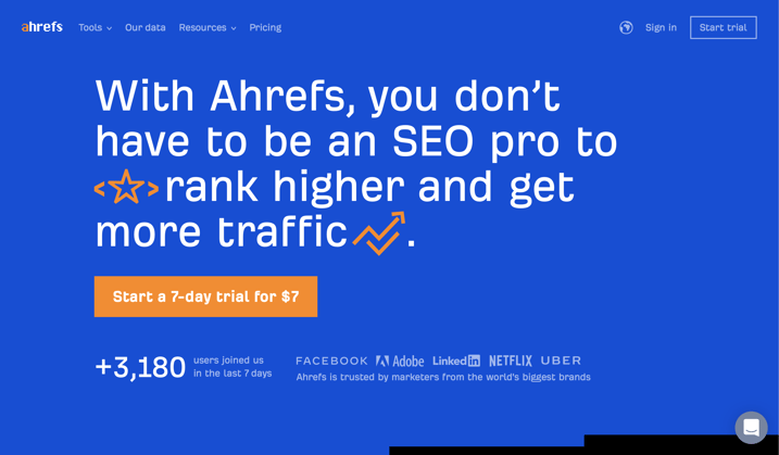
Ahrefs
Ahrefs makes good use of white space (in this case, blue) on their homepage. It is difficult to strike a balance between white space and content. However, this website design allows the copy proper spacing and sizing, resulting in a greater opportunity for conversion.
Without overwhelming the user with too many options, the folks at Ahrefs have opted to show one bold CTA in orange to stand out from the background. This contrast quickly guides the user to the next step - which is to start a free trial.
Pure Cycles
The most essential elements in any eCommerce website are the logo, navigation menu, search box, navigation utility links and the site’s main image. Pure Cycles includes all of these elements above the fold.
Additionally, to ensure the consumer is not overwhelmed by all of the essential elements, Pure Cycles utilizes a contrast in colors and type to create some hierarchy between all of the elements.
The navigation menu in black holds information for customers looking to learn more, while the navigation menu in white directs visitors to products in which they can purchase.
Finally, this website adds some intrigue with beautiful lifestyle photography.
.png?width=751&name=ecommerce-site-designs-pure-cycles%20(1).png)
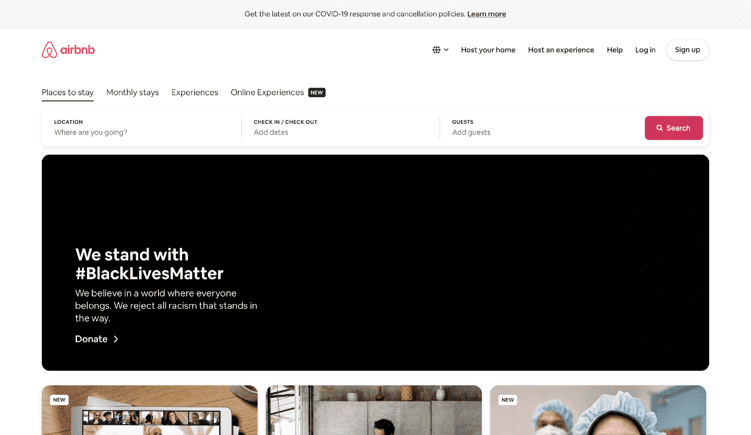
Airbnb
It's important to be a step ahead of consumers. Airbnb is a shining example of this. The top of the home page includes a dynamic search bar that allows users to search for a place to stay as soon as they reach the home page.
Not only is this convenient, but it also ensures a quicker path to purchase. Without this search bar explicitly on the home page, some users may drop off.
Plus, we appreciate how the company responds to the current situation going on in the country with a bold statement on the home page.
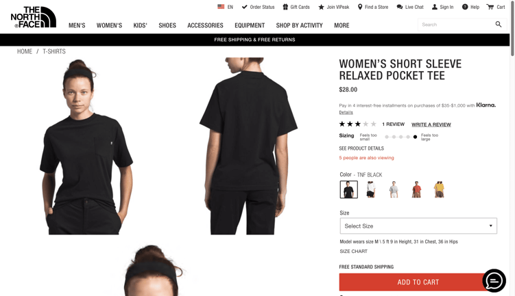
North Face
When creating a path to purchase, it is essential to direct the consumer through the process. One way to do this is to highlight a CTA, and North Face is extremely successful at that.
By using a contrast in color and typography, the user is directed through the site. Additionally, the CTA button is red and large, ensuring there is no drop-off in the final phase of purchase.
The ‘Chat’ button is another added bonus, ensuring that the consumer can have any questions/concerns answered from the comfort of the same webpage.
Conclusion
We hope these eCommerce site designs inspire the design of your web pages. Make your brand's online encounter with consumers memorable, and create a intuitive shopping experience. You only have one chance to make a first impression!
If you need help with your eCommerce website design, contact us through the form below with any questions or concerns. Our team will be in touch!