


Shopify reports that 82% of smartphone users consult their devices when making an in-store purchase. Add in the number of sales made exclusively on mobile devices and the importance of mobile optimization becomes unavoidable.

eBook
Mobile eCommerce Checklist: Optimizing Your Online Store

The challenge for many businesses, however, is developing a mobile eCommerce strategy that makes sense for them. Ultimately, going through this prior to investing time and money can be the difference between success and failure.
To help, we've outlined four mobile eCommerce trends to watch and included considerations for a successful mobile strategy.
Mobile eCommerce Trends To Look Out For
As mobile shopping experiences continue to evolve, brands will need to anticipate mobile shoppers. Specifically, they should cater to their needs in both a digital and in-person shopping experience.
Businesses can ensure a frictionless conversion path by offering native mobile checkouts. Integrating social marketing efforts with social selling will help to convert followers into customers.
As you create and implement your mobile strategy, we recommend keeping an eye out for these trends:
- Anticipate Omni-Channel Shoppers
- Offer Native Mobile Checkouts
- Connect Social Marketing to Social Selling
- Apps vs Mobile-Optimized Experiences
1. Anticipate Omni-Channel Shoppers
Reach your customers whenever and wherever they are ready to connect. Many in-person shoppers use their devices to validate purchases, so you should anticipate low, reduced bandwidth and longer load times. As a result, you should consider images sizes when optimizing your breakpoints.
We recommend compressing images or using different images for mobile breakpoints to speed up your site and improve mobile experience. If a site or page takes longer than three seconds to load, shoppers will likely move on. In fact, BigCommerce found that 40% of consumers will leave a site completely if it takes longer than 3 seconds to load.
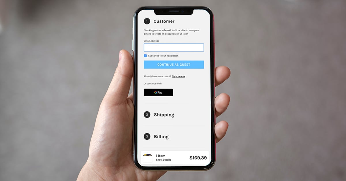
2. Offer Native Mobile Checkouts
Thankfully, the days of pinch and zoom are far behind us when it comes to mobile eCommerce. However, the advent of mobile-optimized checkouts has revolutionized the way consumers interact on their devices.
When it comes to a mobile checkout experience, less is definitely more. Any opportunity to reduce clicks, screens, fields, taps and swipes will ultimately translate into more purchases.
PayPal, Apple Pay and Android Pay are good options to include that will speed up the check out process and make it easier for your customers. We love that BigCommerce natively includes these payment options with its eCommerce platform and highly recommend exploring its potential for your business.

3. Connect Social Marketing with Social Selling
Shopify found that 55% of customers have bought something online after discovering it on social media. If you already use social media as a marketing technique, try integrating it with your eCommerce platform.
This connection between platforms is an easy way to increase sales or site traffic. If you haven't already, we recommend exploring shoppable Instagram posts if they make sense for your business.
Staying up to date with mobile eCommerce trends will keep your site run smoothly and create an enjoyable experience for customers. A happy customer becomes a loyal customer, and that results in increased sales and revenue.
Crafting A Mobile eCommerce Strategy
There are two specific mobile sales channels: mobile-optimized websites and apps. Each solution aligns with specific customer needs and determining the appropriate one for your business ultimately starts a solid strategy.
1. Understand the Audience
First, it's vital to find out who your customers are and what they are look for in a mobile experience. Use Google Analytics to evaluate what devices and browser generate the most traffic from your site.
From there you can better answer questions about who your current customers are and how they shop. When you really understand the end users, you can set realistic goals and determine solutions that make sense for your business.
2. Identify the Goal
Once you've defined your audience, you must determine your overall goal in the mobile marketplace. Whether you aim to to increase customer satisfaction, drive traffic through eCommerce SEO or generate mobile sales, your goal will determine your mobile approach. Specifically, this can relate to AMP pages, image sizing, specific mobile breakpoints and more.
Different technologies can resolve different problems, so it's essential at this stage to determine what you're trying to accomplish. Clearly outline the desired actions you want your end-users to take and the ideal technology solution will start to materialize as you research.
Apps vs Mobile Websites
Mobile Apps
Dedicated mobile apps require a user to search for you in a marketplace, then download and open your custom application. Realistically, that process is full of opportunities for customer fall-off. Consider whether your business can develop loyal customers who will remain engaged throughout that process.
Also, app success does not end with downloads. You must provide a rich enough experience to make the app valuable to the customer well past the initial download.
Remember that mobile apps should not just regurgitate your entire online catalog. Rather, they should be focused on creating a rich and rewarding experience through valuable features and content.
Mobile-Optimized Websites
In this scenario, you have the ability to create a shopping experience that customers are familiar and comfortable with. As a result, they will be able to navigate and checkout with less acclimation. Building a mobile optimized store will also help your business show up in searches and allow users on different devices to view explore your products.
3. Deploy the Strategy
If you take steps to understand current mobile eCommerce trends and how they can be implemented for your business, you can develop a strategy that is more likely to convert mobile traffic into dollars for your company.
In addition to keeping up with mobile eCommerce trends and strategies, we recommend following these mobile eCommerce best practices so that you can capture the majority of these online sales.
Mobile eCommerce Best Practices
We're sharing some mobile eCommerce best practices to help you better optimize your site for mobile and increase conversions:
- Use a fingerprint to sign into an account
- Use a top navigation menu
- Keep the search bar above the fold
- Consider the "thumb zone"
- Provide a "save for later" option for the shopping cart
- Provide a one-page checkout
Use A Fingerprint To Sign Into An Account
As consumers, I'm sure we've all had a bad online shopping experience at one point or another. Imagine that you spend over an hour browsing a website on your mobile device adding items you're willing to purchase to the shopping cart.
Then boom - you're prompted to sign into your account before checkout. So you sign in only to find that all of the items that were in your shopping cart disappeared.
This happened to me as I was online shopping during quarantine, and I immediately abandoned the shopping cart (and the entire website, for that matter) due to my frustration.
Avoid angering customers and delaying the conversion process. Instead, prompt users to use their fingerprints to sign into their account before they begin shopping.
Whether you have a mobile-optimized website or a mobile app, allowing customers to quickly sign in with one touch of their finger saves them the time and trouble of having to type in personal information and remember a password.
Use A Top Navigation Menu
We highly recommend using a top navigation menu when optimizing for mobile eCommerce. This provides clear direction and allows customers to easily navigate throughout your website to find what they're looking for.
Do you offer options for both men and women? How about shoes and accessories, in addition to clothes? Keep these options readily available in the top navigation menu to ensure consumers quickly find exactly what they're searching for.
Keep The Search Bar Above The Fold
According to HubSpot, 48% of customers started searching for the product they bought on mobile first. These high-intent visitors are the most likely to convert because they already know what they're looking for and how much they're willing to spend.
Keeping the search bar above the fold is the most effective way to grab convert online shoppers into customers. In fact, visitors who interact with site search are 3 to 5 times more likely to become customers.
Consider The "Thumb Zone"
Although mobile devices vary in size, the "thumb zone" stays the same. When optimizing your site for mobile eCommerce, think about how consumers naturally hold their phones or tablets in their hands.
Adapt your user interface to place the intended buttons and calls-to-action in a convenient location to improve usability and ultimately increase conversions.
Provide A "Save For Later" Option For The Shopping Cart
Online shoppers abandon their carts for a variety of reasons. I think we all can agree that it's easy to get distracted on the Internet - whether it comes to ads constantly being shoved in our faces or notifications beeping consistently.
If your eCommerce store struggles with a high abandoned cart rate, there's a reason for it. Sometimes, online shoppers genuinely forget that they've left something in the shopping cart. Resolve this issue by providing your visitors with the option to save items for later.
Whether they needed more time to think about the purchase or to compare competitors' prices, providing consumers with the option to save products for later will remind them to reconsider purchasing something that were previously interested in.
Provide A One-Page Checkout
Optimizing the checkout process by creating a one-page checkout is the ultimate key to increasing conversion rates. Remember, your visitors spent a considerable amount of time searching for the items that they are now ready to purchase.
Be sure to provide a quick and painless checkout experience. Keep the form short, and ask for only necessary information. If they don't have an account, let them continue purchasing as a guest. Don't force your visitors to sign up for an account at the checkout as this will dissuade them from converting.
5 Mobile eCommerce Design Tips To Implement ASAP
Cater to the consumers who regularly shop on mobile devices by optimizing your online store for mobile. Follow these 5 mobile eCommerce design tips to enhance your site's layout, improve the user experience and increase conversion rate:
- Use smart search
- Limit text on product pages
- Consider the thumb zone
- Use Sticky CTAs
- Provide a one-page checkout
Use Smart Search
We encourage any website with on-site search to leverage smart search to improve the mobile eCommerce user experience. With smart search, the design of the box enlarges to fit the size of the mobile screen. Also, be sure your site search box is at least 43 pixels high for an optimal usability.
Additionally, predict users' searches with auto-fill options to make the search experience quicker and make finding what they're looking for easier. Then, track your customers' search terms within your site to further target them with related products or services.
Limit Text on Product Pages
When optimizing a mobile eCommerce design, remember that there's much less screen real estate to promote your offer than there is on a desktop. For brands, this means including only the absolute essentials on all web pages, especially product pages.
Limit text on product pages to include only the most necessary information to the shoppers, like product name, price, variant options and a call-to-action button. This helps to avoid a cluttered mobile web page and ensures the user isn't overwhelmed with information.
We recommend hiding additional detailed product information in a collapsible view so that users can choose whether they want to click to learn more about the product. Plus, it helps accelerate them on the path to purchase because there's nothing distracting them from your CTA button.
Consider The Thumb Zone
Since mobile devices vary from small smartphones to large tablets, the thumb zone − or the area in which it is easiest for users to click with their thumbs − remains the same. Consider the way you hold your phone; it's easier to click buttons when they're in certain spots rather than others because it's comfortable for your thumb.
Alleviate shopper discomfort by adapting your user interface to how people naturally hold their devices. We recommend putting your CTA button on the bottom portion of the screen so that it's easily accessible.
Use Sticky CTAs
On areas like a product detail page, it's important to make sure your content doesn't interfere with your CTAs. We recommend using sticky CTAs to ensure a seamless user experience and an enhanced mobile eCommerce design. For example, include a sticky CTA, like an "add to cart" button, on your mobile product pages to easily guide users through the purchasing path and increase conversion rate.
Provide a One-Page Checkout
Decrease shopping cart abandonment and increase conversion rate with a one-page checkout. Create a unique strategy to improve site speed, increase consumer trust and promote value.
As one of the most immediate, high-impact strategies for increasing online sales, we encourage following these checkout best practices to reduce checkout friction. Focus on improving your site's speed, page load times and the speed in which a customer can successfully complete a checkout.
Also, make sure your customers understand that your website's mobile checkout is secure. Show off your trust seals and badges to verify that your online store is a secure place for consumers to enter their credit card information.
Last, demonstrate your brand's value to your customers by including any promotional offers or product deals within the one-page checkout. By increasing this perceived value, customers are more likely to convert.
Conclusion
Although we don’t believe every business should follow mobile eCommerce trends, we always recommend keeping up-to-date with the latest industry practices. For more inspiration, check out these 5 highly optimized mobile eCommerce sites.
Want to learn more about how to improve your website's mobile eCommerce experience and prepare your mobile store for a website launch? Learn more about our eCommerce Website Design services and contact us to get started.
